I’m so excited to be back with part two of our two-day feature with two of our very own North Carolina Blogger Network members, Susannah Brinkley and Madison Wetherill. They both wrote fantastic posts on branding and I can’t wait to share both with you! Yesterday I shared why consistent branding is essential with Susannah, and today, I have Madison sharing 5 ways to achieve consistent blog branding.
Branding is an essential part of a successful business. Every blog, whether it’s making money or not, is like a business and should also have beautiful and consistent branding. Today I’m teaming up with Susannah of Feast + West, a fellow blogger and graphic designer, to share why branding is essential and some easy ways to achieve it! Be sure to stop by her half of the post to learn why branding is essential!
Branding is one of those things I really didn’t think about when I started a blog. Granted, my design skills were much different then, and have since grown a ton! Naturally, there were lots of things I did to create a sort of brand, but it wasn’t until my move to WordPress that I began making sure that everything was branded the same. Inconsistent branding is something that can really set your blog apart, and not in a good way! Our nature is to like good design and things that are appealing to the eye.
So what are some ways you can make sure to have consistent branding on your blog?
Start with a Brand
It may seem like common sense, but starting on the right foot really does make all the difference! It’s pretty impossible to maintain consistent branding if there is no branding to begin with, right? So, how do you start with a brand? Branding isn’t as simple as maintaining a consistent font, though that’s part of it. Branding is when there is a lot of thought put into what your blog looks like, which includes the name, logo, color scheme, and even post topics!
These things can definitely be developed on your own, but I highly recommend working with a designer who can achieve your goals for your brand. It’s a lot faster and saves a lot of headache in the end. I know so many of my blog friends who went through countless tweaks and redesigns on their own before working with a designer and really falling in love with their brand. I work with a limited number of blog design clients a month and I’m currently booking right now. You can find more info here.
Limit to 2-3 Fonts
A huge issue I see within blogs is an overuse of fonts. A good rule of thumb in design is to never have more than three different fonts within a design. It’s confusing to the eye and it also makes it difficult to build a brand that your readers will recognize. Even if someone isn’t a reader yet, you may start to develop a well-known brand through sites like Pinterest, where people will begin to recognize your blog posts by the branding within the pinned image. Ninety percent of my posts use two fonts, ones that are found consistently throughout my blog as well. When I find a new font I love and have to use, it still has the same personality as the fonts I already use.
Knowing which fonts to use also is driven by having a blog brand/design to begin with. Your design will be able to provide font names for you to use and maintain consistency on your sidebar and post images. If you like a few fonts, pick 2-3 fonts for your pins and rotate between them, this way there is at least some consistency between your posts. As Susannah says, “Fonts are like boyfriends, you only need a few!”
Maintain High-Quality Graphics and Images
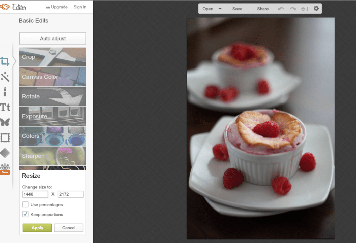
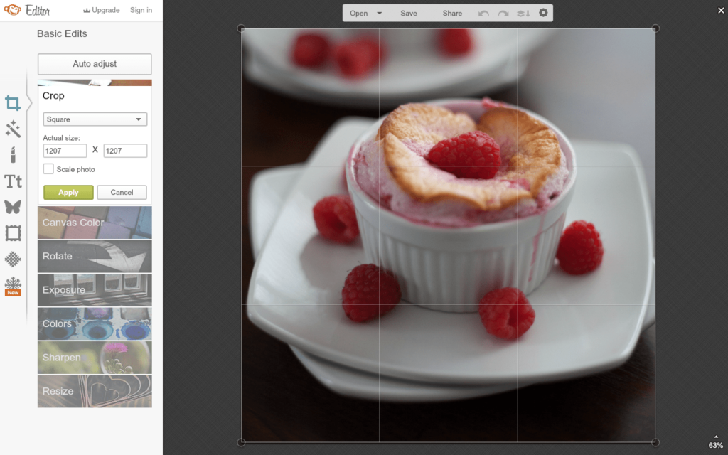
Second to crazy font choices, another issue I see is stretched or low-quality images. This can absolutely destroy your brand on your blog and make people turn away from your quality content! There are tons of resources out there for how to take better photos and for resizing images. Think of it this way, if you have a rectangle, in order to make it a square, you have to squish the rectangle to fit. But that will distort what’s inside the rectangle. But, if you crop the rectangle into a square, you’ll maintain the integrity of the image. Here’s an example. Let’s say I want these raspberry soufflés to be in a square for Instagram.

To make it a square, I have to have the same size on the horizontal side and vertical side. To do this, I have to uncheck keep proportions. Hint: Don’t ever do this. But for fun here’s what my image would look like.

Knowing these few basic rules of cropping and resizing photos can make a huge difference!
Pick a Color Scheme
When building your brand and/or logo, you’ll likely come out with a color scheme you can follow within your brand. If you’ve noticed, a lot of my pinnable images include the light blue color that is in my header design. This is not on accident or because I’m obsessed with blues and mints. It’s all a part of the branding process! This is why designers often provide a brand board to really capture the essence of the brand and to share the color scheme with the blogger.
Even if your logo is black and white, you may have some color added on your sidebar for social media icons, and category buttons, or you can even use a color from a photo of you on your sidebar. Whatever color(s) you choose, make sure you stick with them. Know which colors in your design are primary colors versus accent colors, and be sure to rely most heavily on the primary colors of your design.
Just like with fonts, your blog design will have a style to it. If your blog is whimsical, you wouldn’t want to all of the sudden use graphics that are grungy and distressed. Likewise, you wouldn’t want to switch from ultra-modern to a rustic and vintage style. It’s confusing to readers and non-readers to understand your brand when there are conflicting styles.
Don’t forget to check out Susannah’s post about why branding is so important! If you have questions about this topic, leave them in the comments.


Ken Bench says
This is really good. Thanks for sharing your ideas Madison. I had a lot of fun reading your blog about choosing the right color scheme for branding. It makes great sense. How about some tips for eCommerce? Appreciate it if you do!